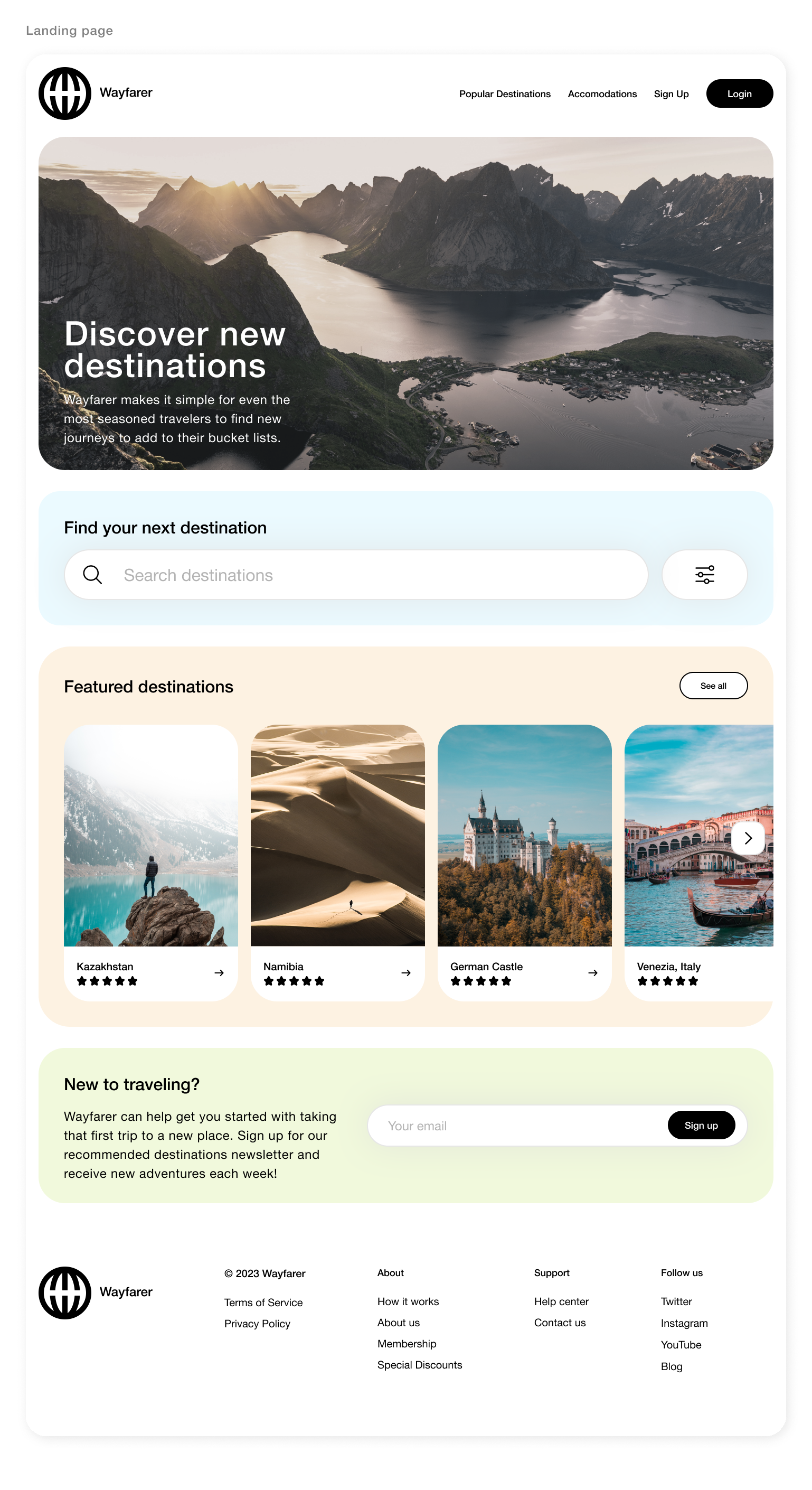

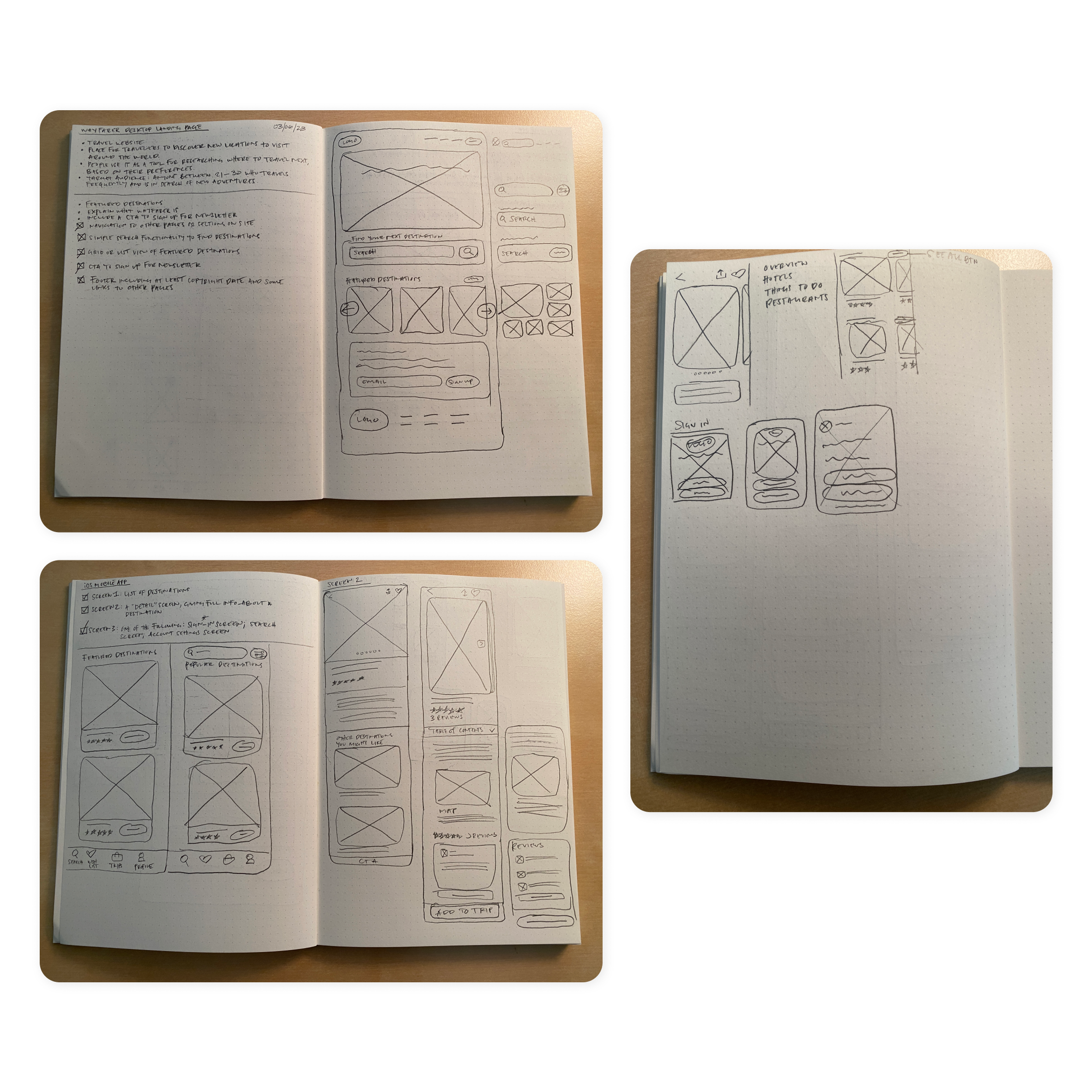
This design challenge was for a travel website called Wayfarer. It is a tool for young travelers to discover new places to visit. The target audience is anyone between 21-30 who travels a lot and is in search of adventure. I was tasked to design a landing page as well as 3 app screens. I believe the feature that is most helpful to the user would be the featured destinations section. It’s a quick and easy way to find new places to travel to. And it’s extremely easy to learn more about these locations just by a click or a tap. I tried to provide as much information that’s essential for the user to get a feel of the destination and not bloat the page/screen with anything more. Another feature that I feel would be helpful to the user is the chat feature. When traveling we always have questions, whether it’s the best places to eat or what to do, etc. This is where you can ask questions or help others that have questions. It’s a fun way to make friends. As for the overall design of the landing page and app, I wanted the overall feelings to be described as simple and friendly. I knew I wanted to use white as the background with light splashes of color as well as rounded corners for the buttons and containers. The focus should primarily be on the high-quality photos and content.